DeepInfra raises $107M Series B to scale the inference cloud — read the announcement
Table of Contents
- Meet Ming-Image
- Vague Prompts Get You Vague Websites
- Write the Prompt Like a Design Brief
- Name the Aesthetic Explicitly
- Put the Real Words in the Prompt
- Lock the Seed, Then Change One Thing at a Time
- Choose Your Aspect Ratio
- A Prompt Template You Can Copy
- Try It
Most website projects stall in the same place: the blank canvas. You can describe the vibe you want in a sentence — "clean, modern, a bold hero, one clear call to action" — but turning that sentence into a first screen someone can react to still means opening a design tool and pushing rectangles around for an hour. The gap between knowing the direction and having something to look at is where momentum goes to die.
Image models are supposed to close that gap, and mostly they don't. Ask a general text-to-image model for a website and you get a photo of a laptop on a desk, or a pretty picture with scrambled text where the buttons should be. Ming-Image is different because it was trained for exactly this job. Give it a real brief and it gives you back a real mockup — nav bar, hero, working typography, buttons that look like buttons.
Meet Ming-Image
Ming-Image-0.1-Design is an open-weight model from inclusionAI, tuned specifically for UI and interface design. At the time of writing it sits at the top of the Artificial Analysis UI/UX Design leaderboard, and it renders a full high-resolution mockup — up to 2560×1440 — in seconds on DeepInfra's inference API, called the same way you'd call any other model.
Here's the thing that matters most, though: the difference between a throwaway image and a mockup you'd actually build from is almost entirely in the prompt. This post is about writing that prompt well. Every image below was generated with Ming-Image and nothing else.
Vague Prompts Get You Vague Websites
Start with the failure case. Here is what Ming-Image returns for the prompt a website:
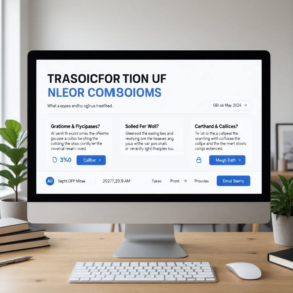
Technically a website. Useless as a mockup. Now the same model given an actual brief:
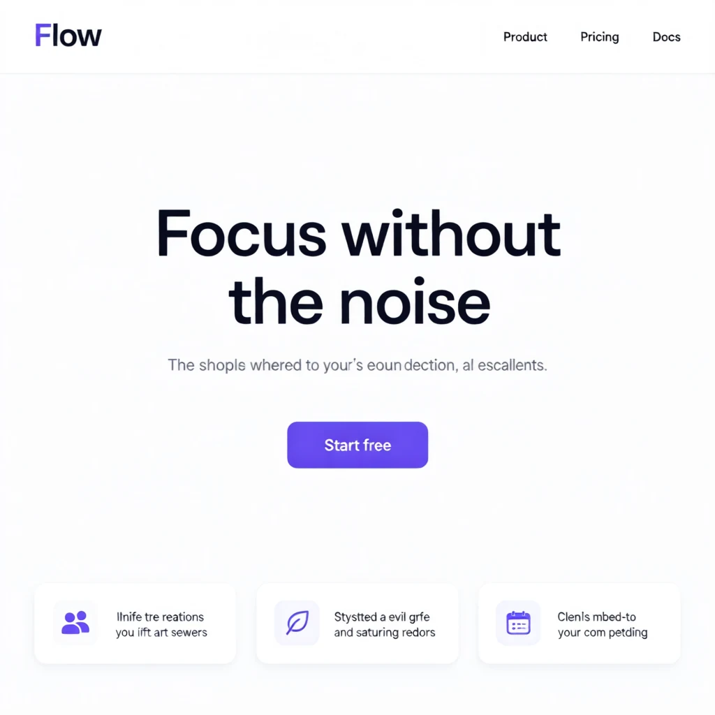
A real landing page — wordmark, nav, hero, CTA, feature row — from one detailed prompt. Same model, thirty seconds apart. The only variable that changed was how much the prompt told the model. That's the whole game.
Write the Prompt Like a Design Brief
The prompt behind that second image reads like something you'd hand a junior designer:
Landing page for a productivity app called Flow. Clean minimal design,
white background, generous whitespace. Top nav with the wordmark 'Flow'
on the left and links Product, Pricing, Docs on the right. Centered hero
with a bold headline 'Focus without the noise' and a subtle gray
subheading. A single purple call-to-action button labeled 'Start free'.
Below the hero, three feature cards with small icons, soft rounded
corners and soft shadows. Modern sans-serif typography.
Three habits make that prompt work, and they'll carry most of your results:
- Name the page and the product. "Landing page for a productivity app called Flow" anchors the whole layout. The model designs for a purpose instead of averaging every website it has ever seen.
- Describe the layout top to bottom. Nav, then hero, then CTA, then feature row. Ming-Image respects spatial order, so walking down the page in the prompt is the most reliable way to control composition.
- Name the components. "Three feature cards with small icons, soft shadows" produces three feature cards with small icons and soft shadows. Ambiguity is the enemy; specificity is free.
Name the Aesthetic Explicitly
Layout tells the model what goes where. Style keywords tell it how the thing should feel — and this is where a few well-chosen words swing the result the hardest. The same instruction to "make a landing page" produces completely different, equally coherent designs depending on the aesthetic you name:
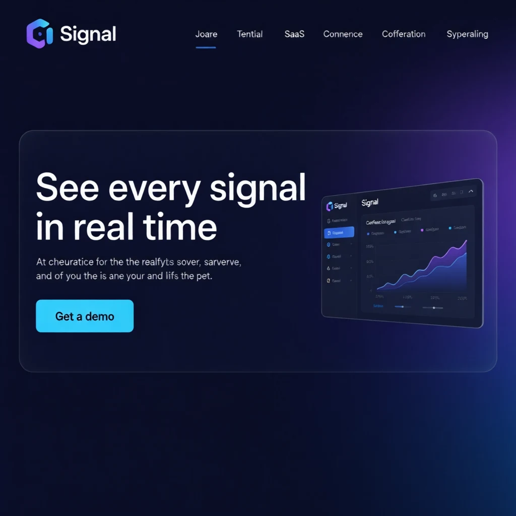
Keywords: "dark glassmorphism, deep navy, purple-to-blue gradient glow, frosted translucent cards."
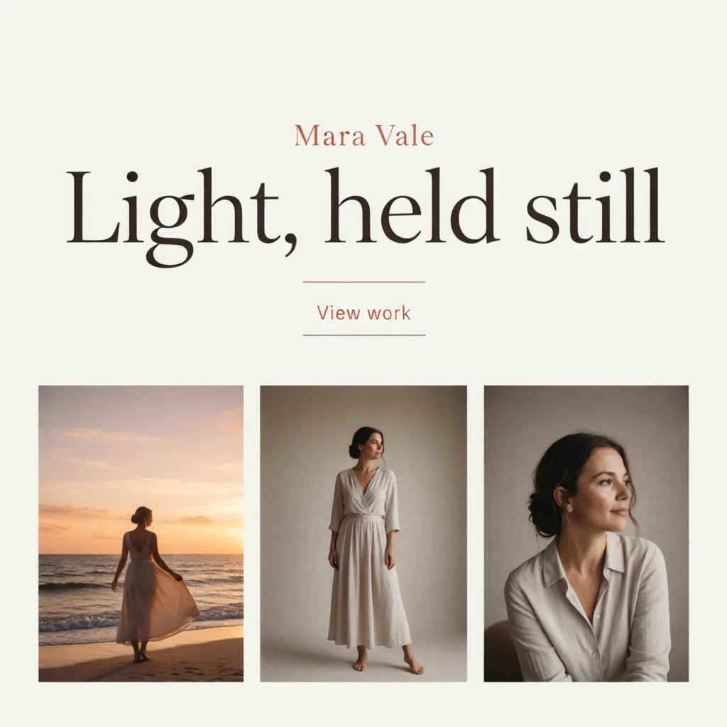
Keywords: "warm editorial, cream background, large serif display headline, muted terracotta accent."
Reach for concrete, visual adjectives the model can actually draw — glassmorphism, frosted, gradient glow, serif display, editorial, brutalist, muted terracotta. Vague mood words like "premium" or "clean" help a little; naming a real visual style helps a lot.
Put the Real Words in the Prompt
General image models smear text into nonsense. Ming-Image renders it — so give it the actual copy you want on the page instead of leaving it to chance. Ask for specific labels and numbers and they come through:
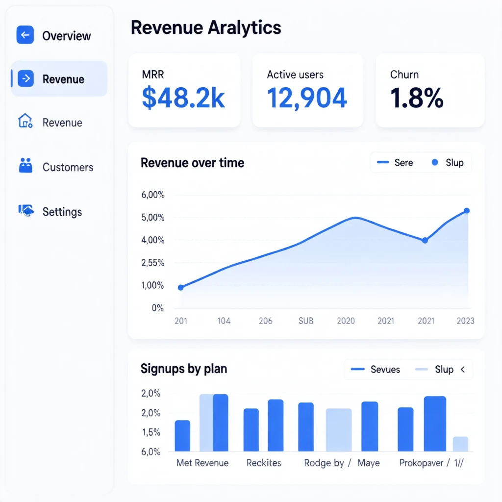
The prompt asked for KPI cards reading "MRR $48.2k", "Active users 12,904", and "Churn 1.8%" — and that's what rendered.
One caveat worth knowing: text fidelity is excellent for short strings — headlines, nav links, button labels, numbers, KPI cards — and still degrades on long body paragraphs, where you'll see believable-looking-but-fake glyphs if you look closely at the small print. So put your real headline, your real CTA, and your real data in the prompt, and drop long body copy in afterward in your design tool.
Lock the Seed, Then Change One Thing at a Time
Every hero shot above used a fixed seed. The seed is the model's starting randomness — hold it fixed and the composition stays stable between runs; change it and you get a fresh take on the same brief.
That gives you a clean iteration loop. When a design is 90% there and you want the CTA green instead of purple, don't reroll blindly. Keep the seed, change the single clause (a purple call-to-action button → an emerald call-to-action button), and regenerate. You get the same page with the one change, instead of starting over. Vary the seed only when you want genuinely different directions to choose from.
Choose Your Aspect Ratio
1:1 is just one option — Ming-Image renders at several aspect ratios, so you can match the canvas to the screen you're designing for. Set the aspect_ratio field:
aspect_ratio | Resolution | Good for |
|---|---|---|
16:9 | 2560×1440 | desktop & landing-page heroes |
4:3 | 2432×1824 | dashboards, slide decks |
1:1 | 2048×2048 | social tiles, avatars |
2:3 | 1664×2496 | mobile screens, posters |
Pick the ratio that matches the layout rather than designing a square and cropping — a mobile screen wants 2:3, a desktop hero wants 16:9. Everything else in the prompt stays the same.
A Prompt Template You Can Copy
Fill in the blanks and you're most of the way there:
[Page type] for a [product type] called [name].
[Aesthetic keywords], [background], [spacing].
Top nav with [logo/wordmark] and links [A, B, C].
Hero with the headline '[exact headline]' and [subheading].
A [color] call-to-action button labeled '[exact label]'.
Below the hero, [components: N cards / a chart / a photo grid].
[Typography]. [Accent color].
Try It
Calling Ming-Image is a single request — the same POST /v1/inference/<model> you'd use for any model, with your brief in the prompt field:
curl -X POST https://api.deepinfra.com/v1/inference/inclusionAI/Ming-Image-0.1-Design \
-H "Authorization: Bearer $DEEPINFRA_TOKEN" \
-H "Content-Type: application/json" \
-d '{"prompt": "Landing page for a productivity app called Flow...", "aspect_ratio": "16:9"}'
Designing a website with AI was never about typing "make me a website" and hoping. It's about writing a brief precise enough that the model can only draw one thing — the thing you already had in your head. Get the prompt right and the blank canvas stops being where projects stall, and starts being where they start.
 GLM-5.3-Flash API Providers: Speed & Cost<p>API Review Summary Metric Value Intelligence (Artificial Analysis Intelligence Index) 42 — well above the open-weight median (18) Speed 55.9 output tokens/sec — slower than the median (85.7 t/s) Latency (TTFT) 3.14s — higher than the median (2.05s) Cost (Z.ai first-party API) $0.15 / 1M input, $0.50 / 1M output; cache discount ~83% Cost efficiency […]</p>
 Introducing Nemotron 3 Super on DeepInfraDeepInfra is an official launch partner for NVIDIA Nemotron 3 Super, the latest open model in the Nemotron family, purpose-built for complex multi-agent applications with a 1M token context window and hybrid MoE architecture.
 Build a RAG App With DeepInfra and LangChain<p>Ask a base language model about your company’s refund policy and it will answer with confidence, fluency, and no idea what your policy actually says. The facts live in your PDFs, your internal wiki, and your ticket history, none of which the model has ever seen during training. Retrieval-augmented generation closes that gap by fetching […]</p>




© 2026 DeepInfra. All rights reserved.